00. Overview
Project Name
LocalBuddy
Duration
Apr 2020 - Jun 2020
Platform
iOS
Tool
Sketch, Photoshop, Illustrator
InVision, Principle
As an international traveller, I always wanted to have local immersive experiences, but it has been not easy to come across the chance.
I always look for the best way to have a wide range of local experiences, but I don't want to spend too much time on research and planning. Also, it's hard to tell whether my choice is good or not with a limited information source about foreign countries. I've decided to design a new app that allows world travellers to explore local areas or activities easily and quickly.
Target User
Travellers seeking local experience
Design Process

01. Research
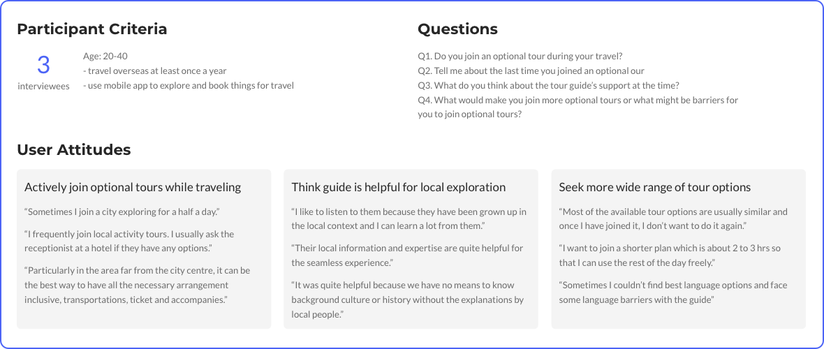
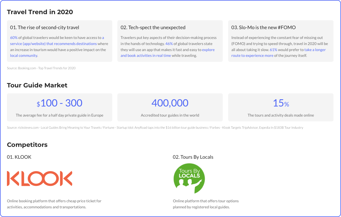
I conducted market research and user interviews, and validated the assumption
"travellers potentially need private local guides to explore local areas and ensure
the quality and safety of the experiences."
User Interview Findings
Market Research Findings
Identified Problem Space
“How might we connect travellers to local guides easily so that travellers can freely enjoy a wide range of local immersive experiences spontaneously?”
02. Synthesis
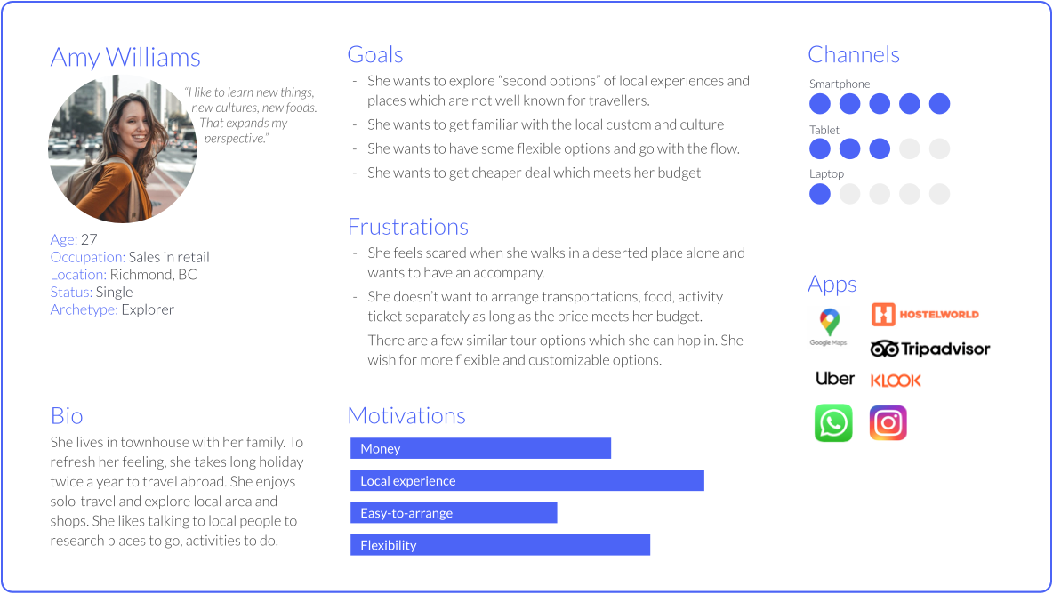
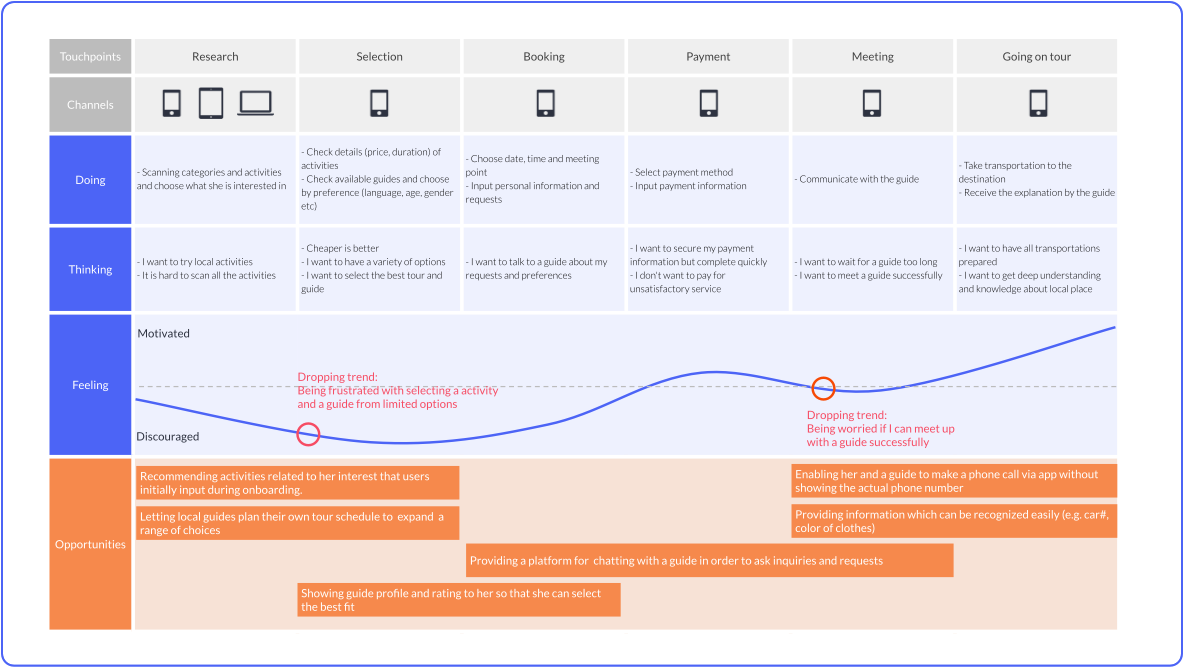
I visualized the user persona to give more tangible shapes to the target users. Also, I drew the user experience map to gain a deeper understanding of the user's pain points.
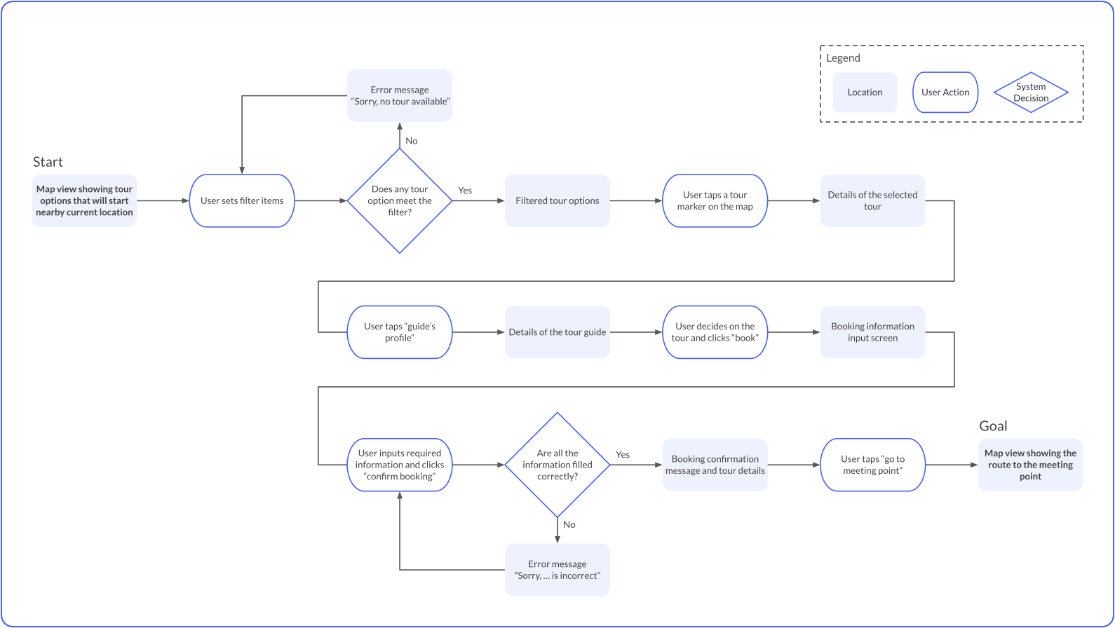
Finally, I determine the main task-flow that I believe helps travellers to accomplish the goal that they would have a wide range of local experiences.
User Persona
User Experience Map
Task Flow Diagram
03. Ideation
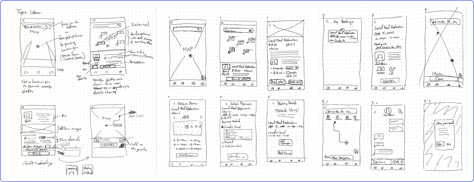
I iterated and tested out the components and screen layouts for the app by paper sketching and greyscale wireframes based on the task flow that I determined in the synthesis phase.
Paper Sketches
TASK 1:
SEARCH FOR TOURS
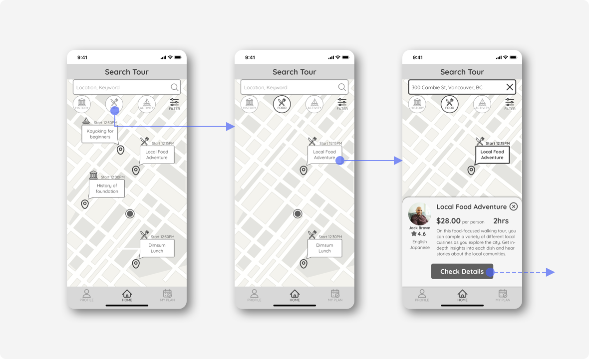
Inspired by Uber UX, I decided to design the location basis search instead of the listing tour search. I believe this feature is unique and differentiates this app from other competitors.
Tour options that start in an hour nearby the current location are displayed as a default. User clicks the category button to filter the result.
Once the user selects a tour marker on the map, the tour description card shows up so that the user can browses options on the map.
TASK 2:
CHECK DETAILS
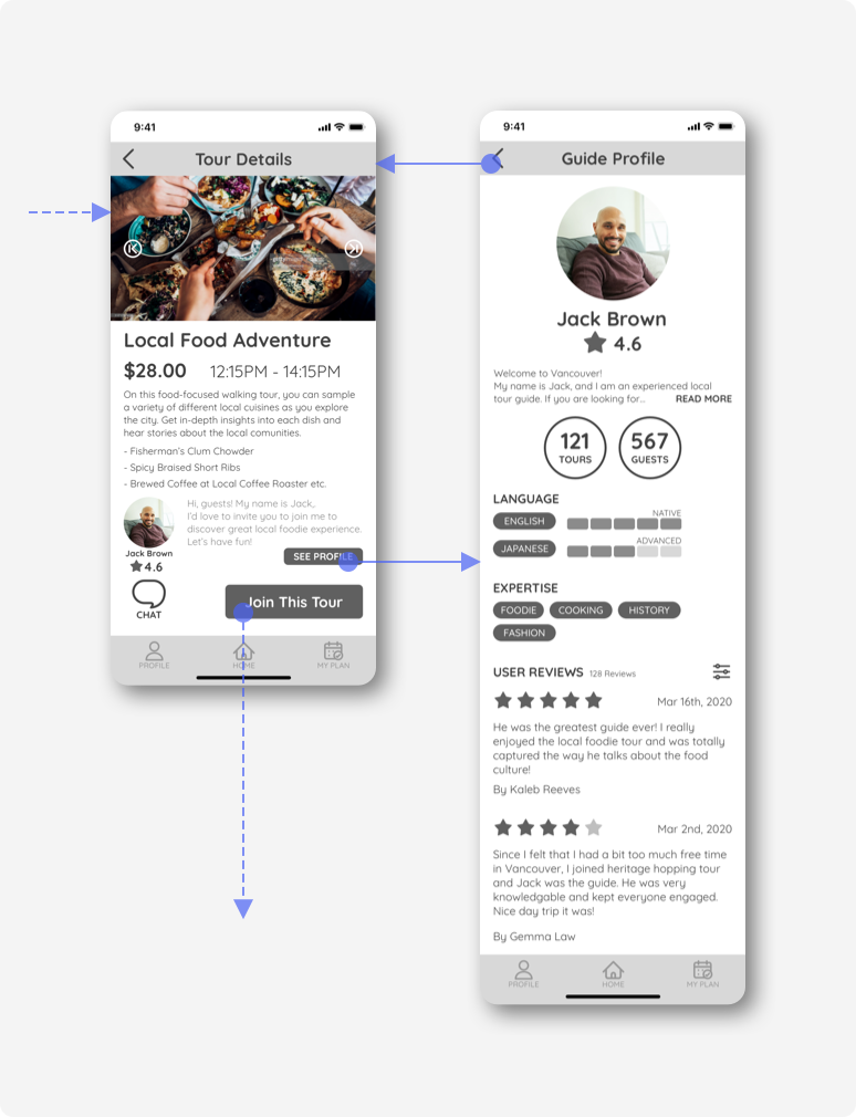
On the tour details screen, the user checks all necessary information (price, detailed description and guide’s introduction), and on the guide profile, also accesses the guide's language skills, areas of expertise and user reviews.
TASK 3:
BOOKING
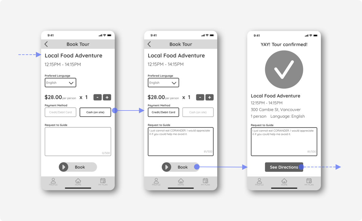
To complete the booking, the user inputs a preferred language, the number of people, payment method and request to guide (if any). I designed the booking button as a slider style one so that users would not make mistaps. When the booking is successfully made, the app displays the confirmation screen and guides them to the navigation view.
TASK4:
NAVIGATION & COMMUNICATION
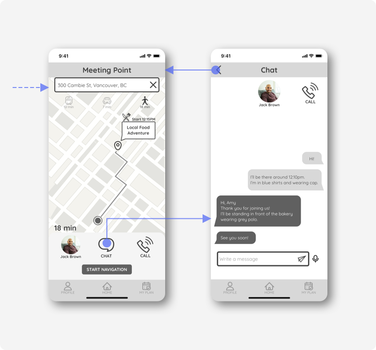
Finally, the user follows navigation to get to the meeting point successfully. As an additional feature, the user can contact the guide via chat or call when he/she is lost or has any troubles.
04. Prototype
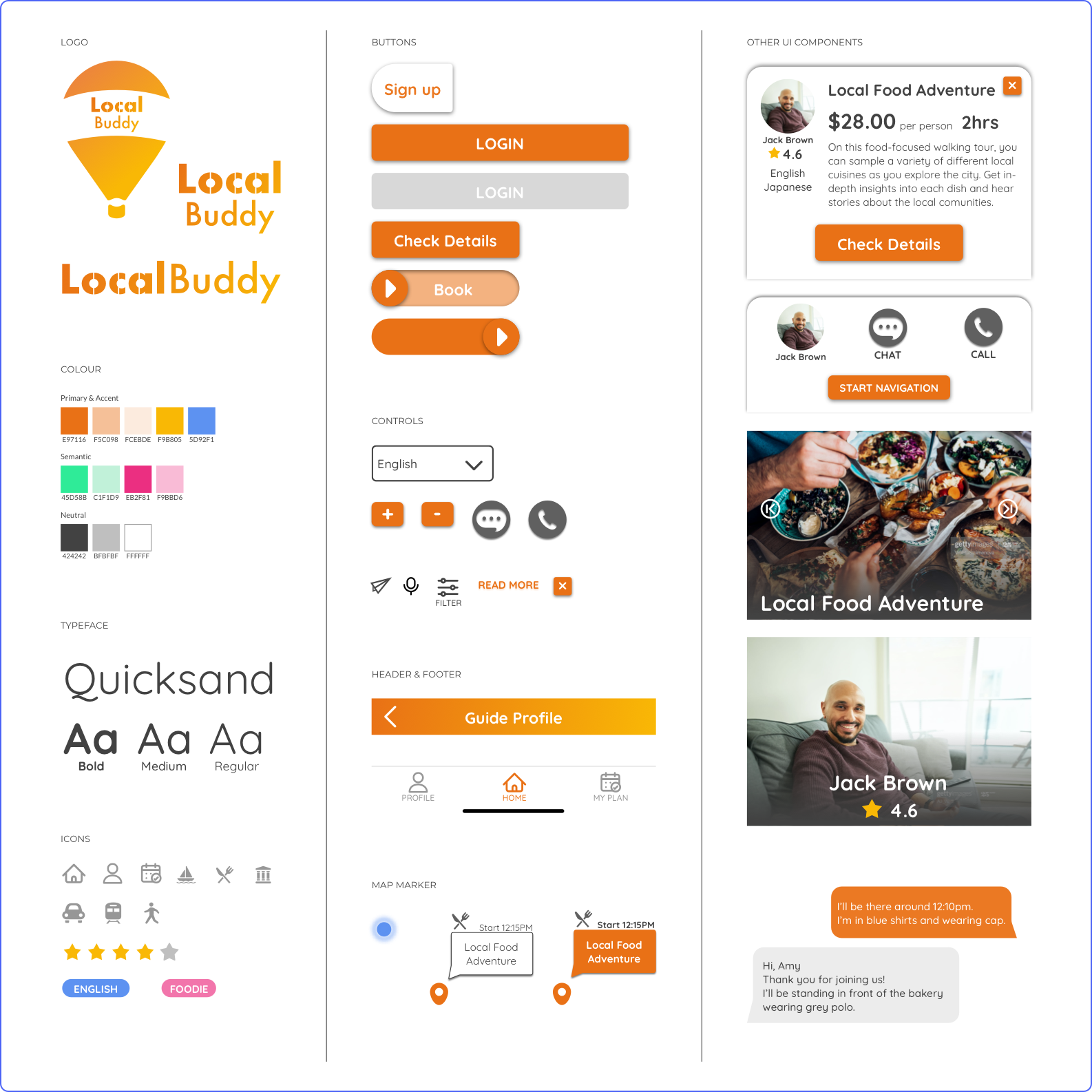
As the final phase, I determined the branding elements: brand name, colour and typeface, and created the interactive high-fidelity prototype. Also, I designed the product marketing website which describes the value of the app and boosts app downloads.
UI Library
ADDITIONAL TASK:
LOGIN
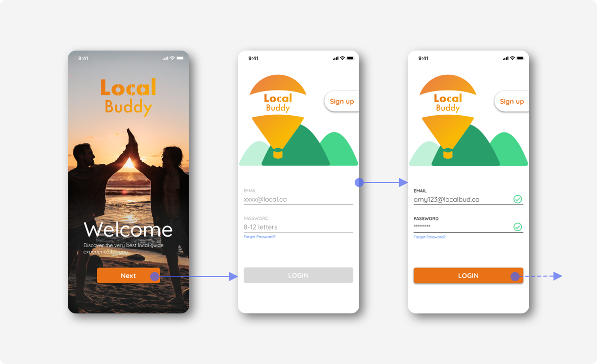
I additionally designed the login screens for novice users who have just downloaded the app. I designed the login flow in a simple and conventional style so that all users would complete the task without mistakes.
Final Prototype
Product Marketing Website
(For Mobile)
I additionally designed the product marketing website which states the value of the app and encourages potential users to download the app. This website also explains how this app works and helps users explore local experiences.
